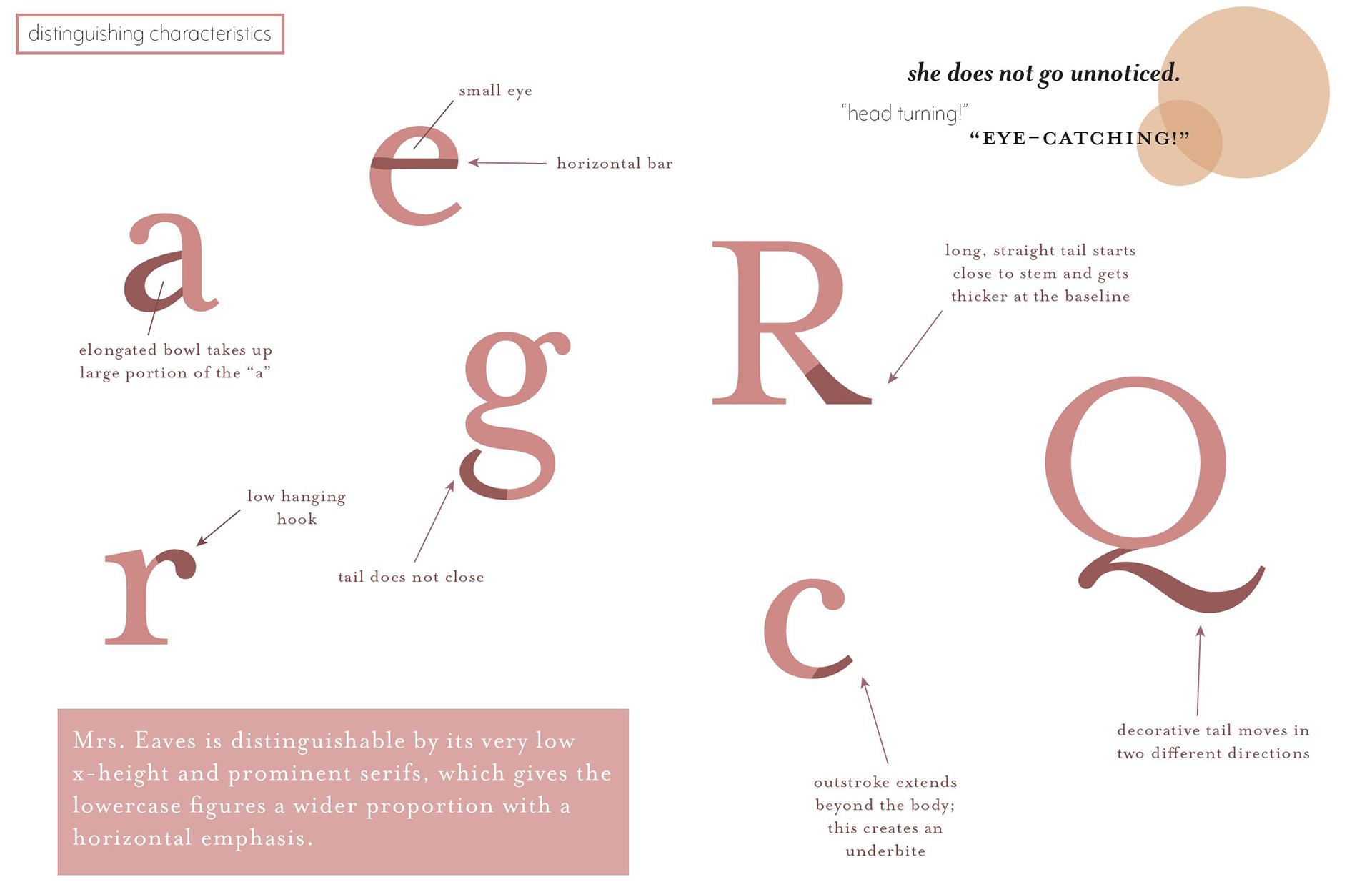
The project was to design a typography handbook analyzing the history, personality and distinguishing characteristics of the chosen typeface: Mrs. Eaves.
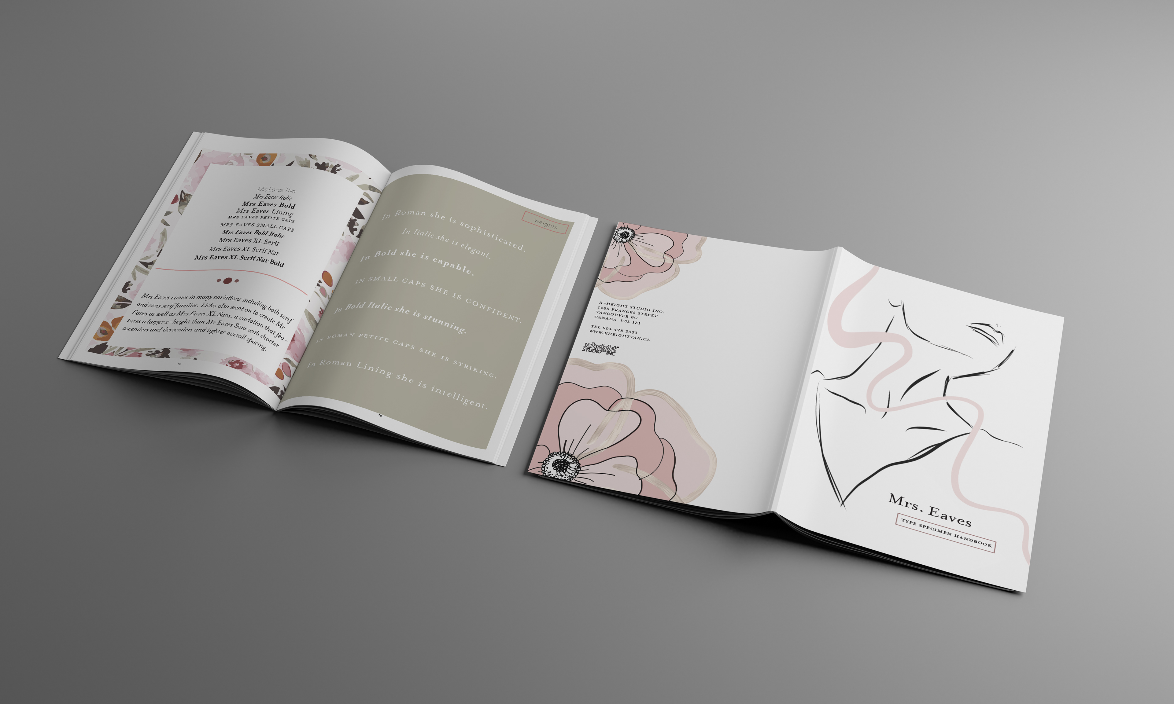
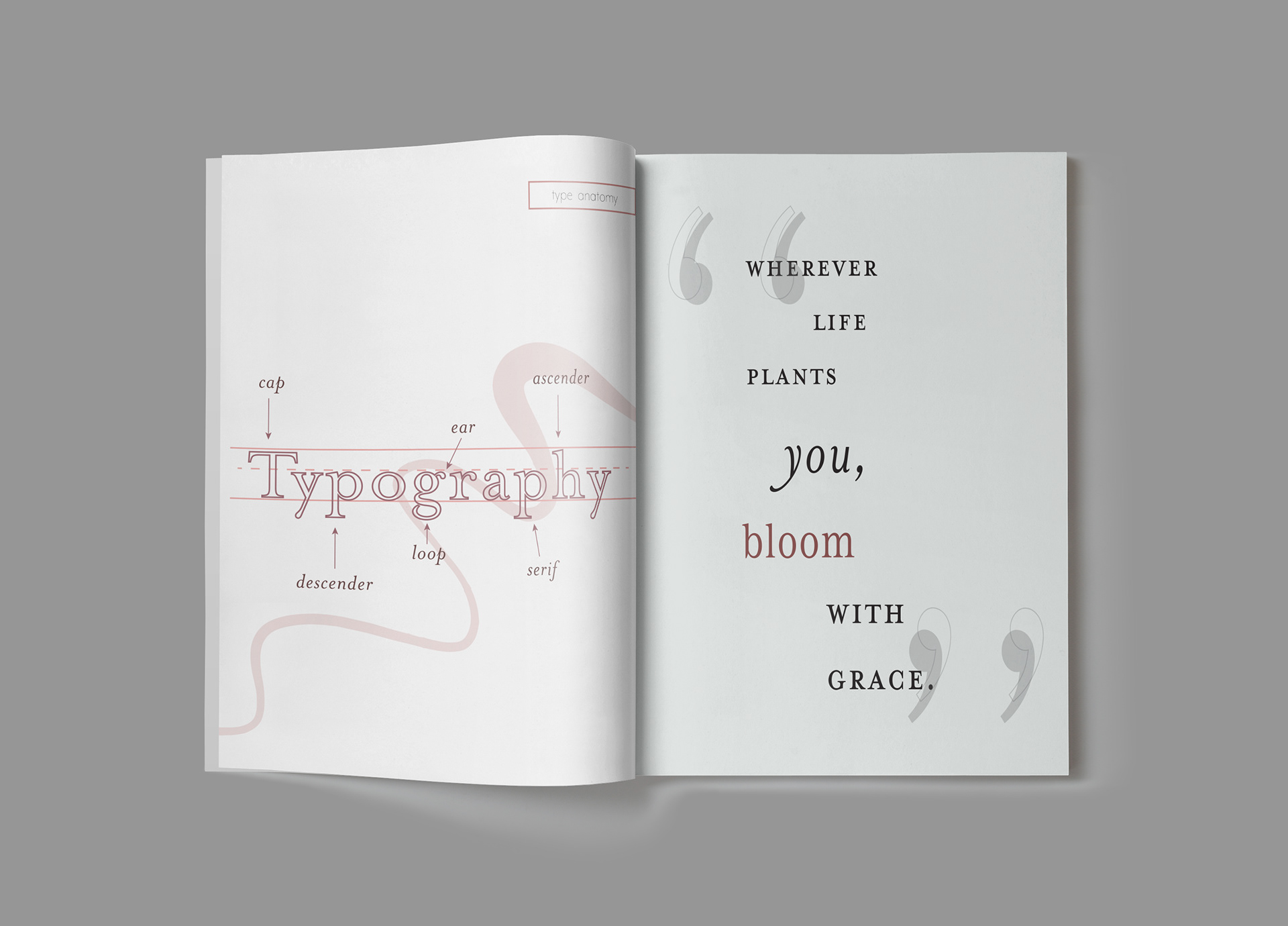
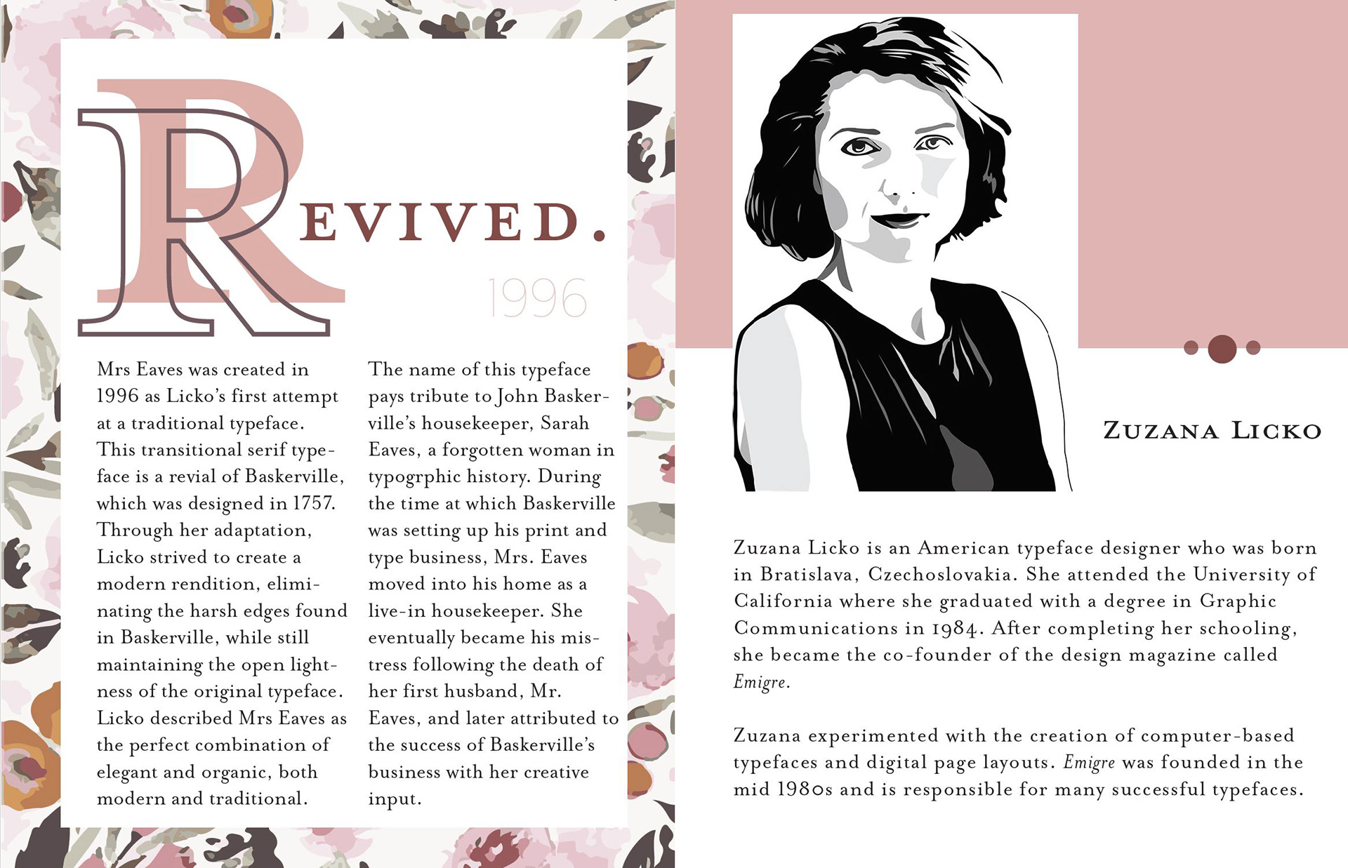
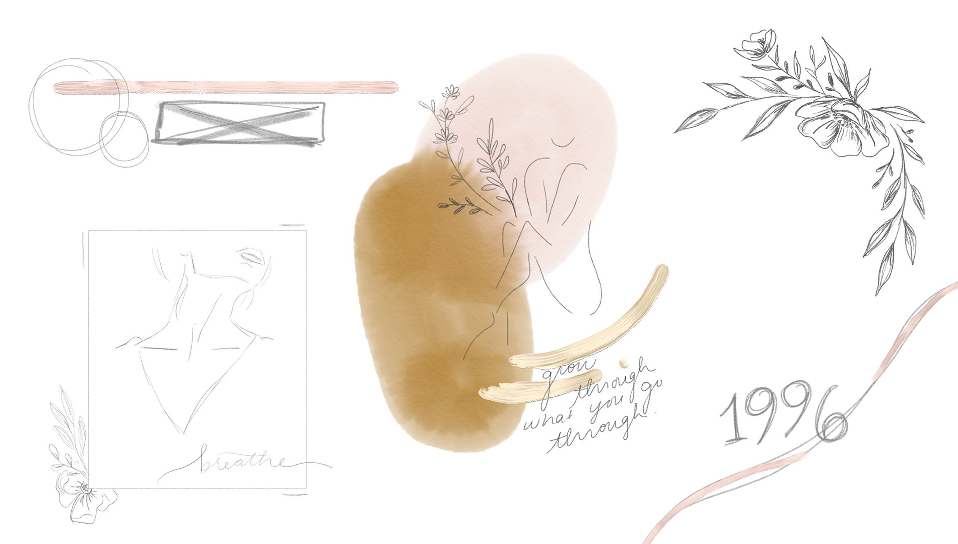
I wanted to create something sophisticated & bold, while still feeling strongly feminine.
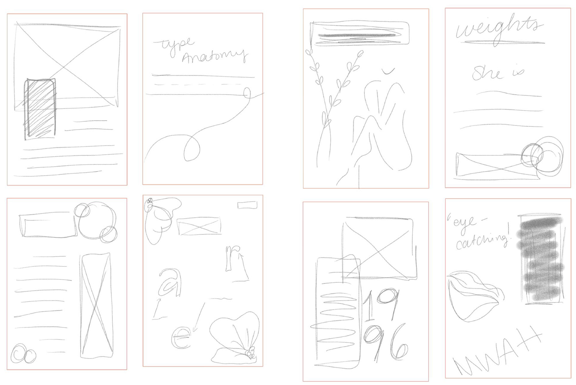
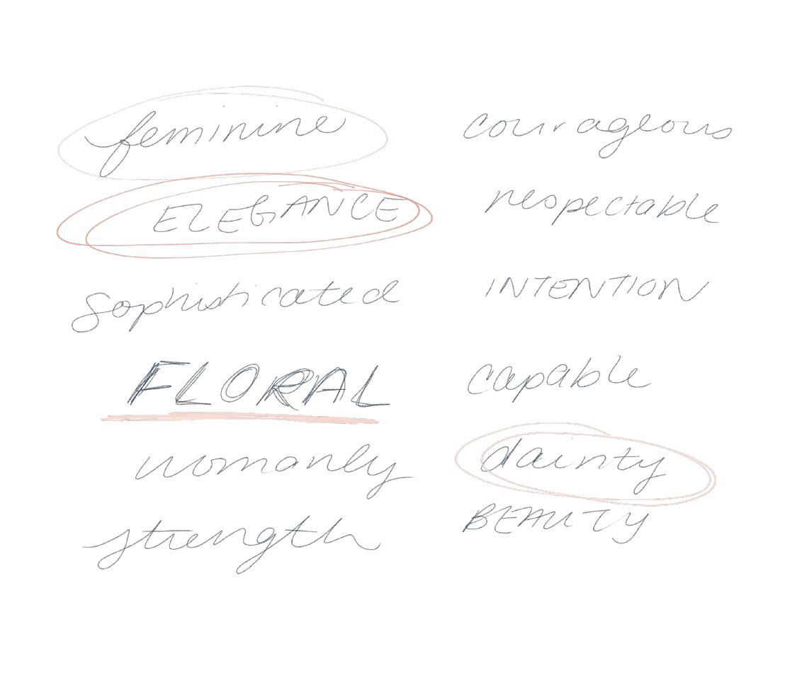
I wanted to make sure the capability of Mrs. Eaves shone through in the design, while also showcasing her delicacy and charm.
I chose a fairly muted colour palette, including soft pinks as well as bold neutrals.