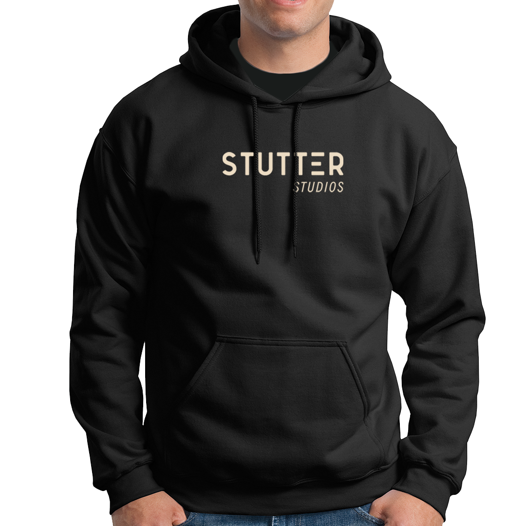
STUTTER STUDIOS
Video Production Studio
- created a visual and brand identity, typographic system, colour palette and custom pattern -
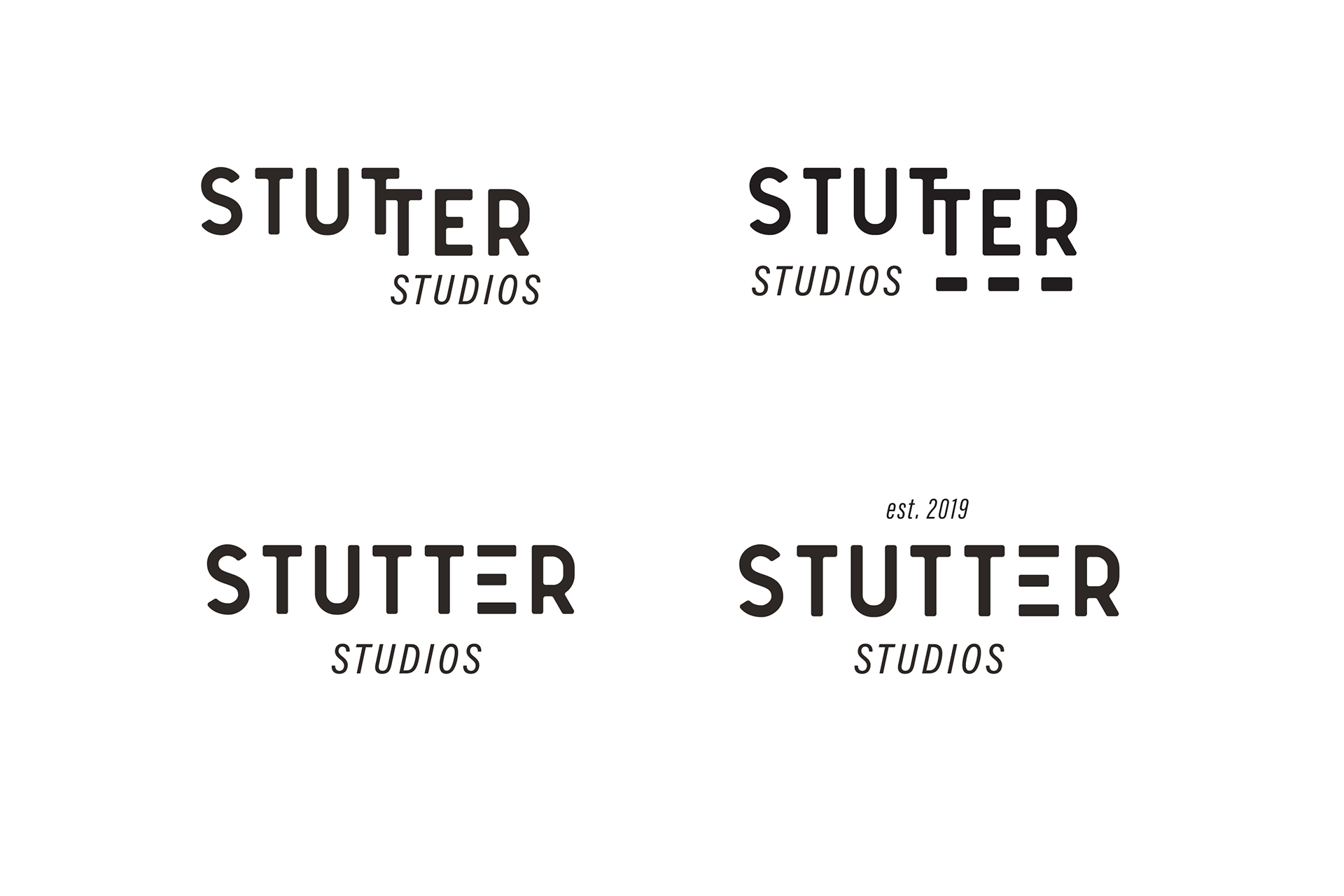
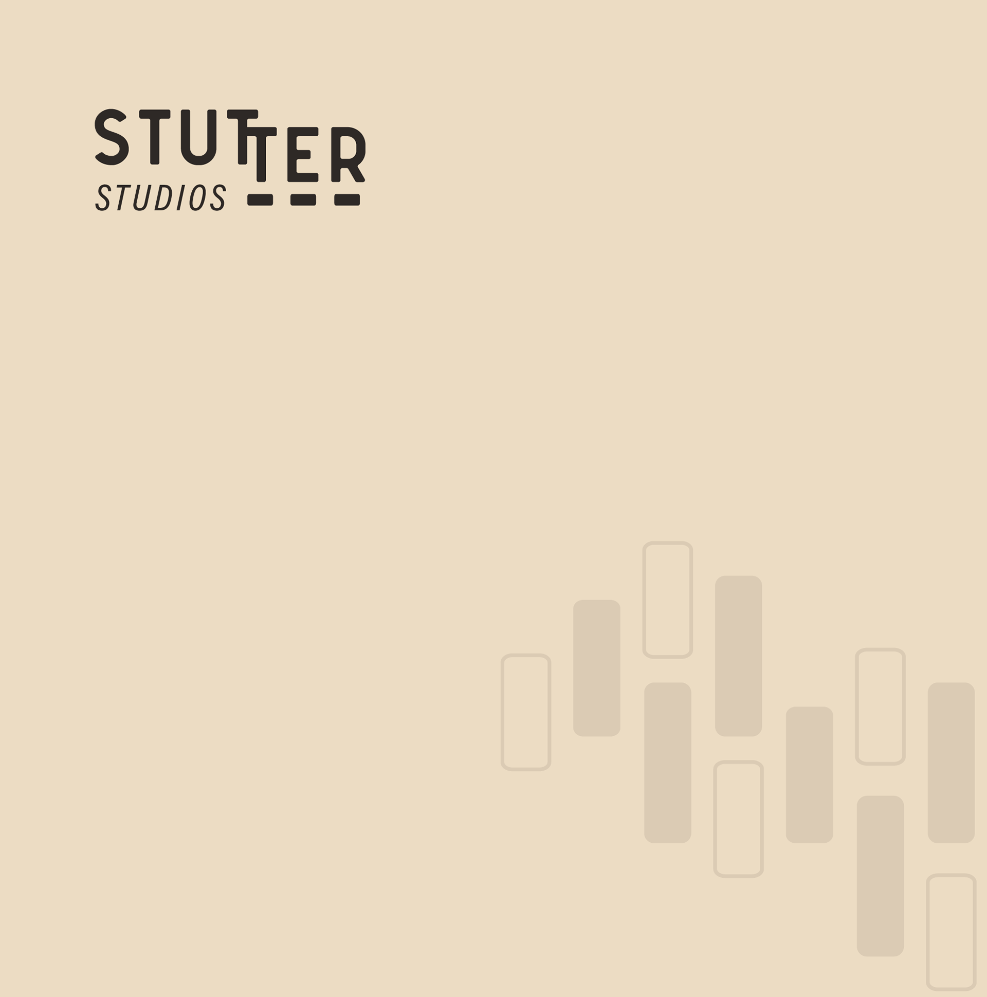
Primary Logos
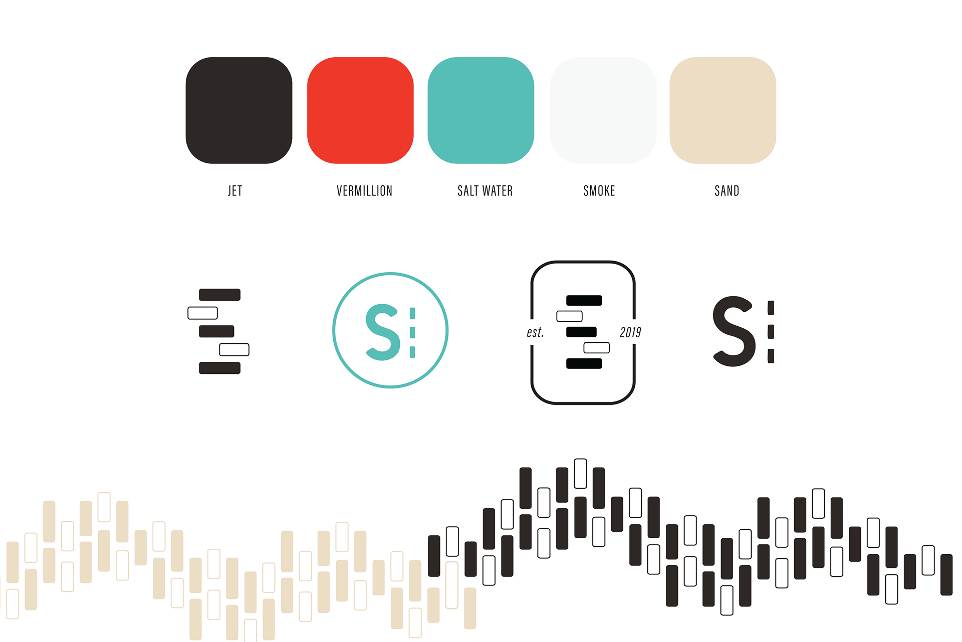
Colour palette, icons and custom graphic element
The graphic element of the staggered ‘T’s in ‘Stutter’ indicate the literal meaning of the word stutter, while bringing an organic feel to the word mark and giving it personality.
More so, the staggering of the word represents that forward momentum is not linear and creativity in itself is thinking and seeing the world differently and uniquely. Here at Stutter Studios new ground is being broken.
The film strip detailing comes together to create a custom pattern that can be used in multiple colours [from the chosen colour palette], oriented horizontally or vertically, overlaid on top of an image or to add visual interest to emphasize certain content.
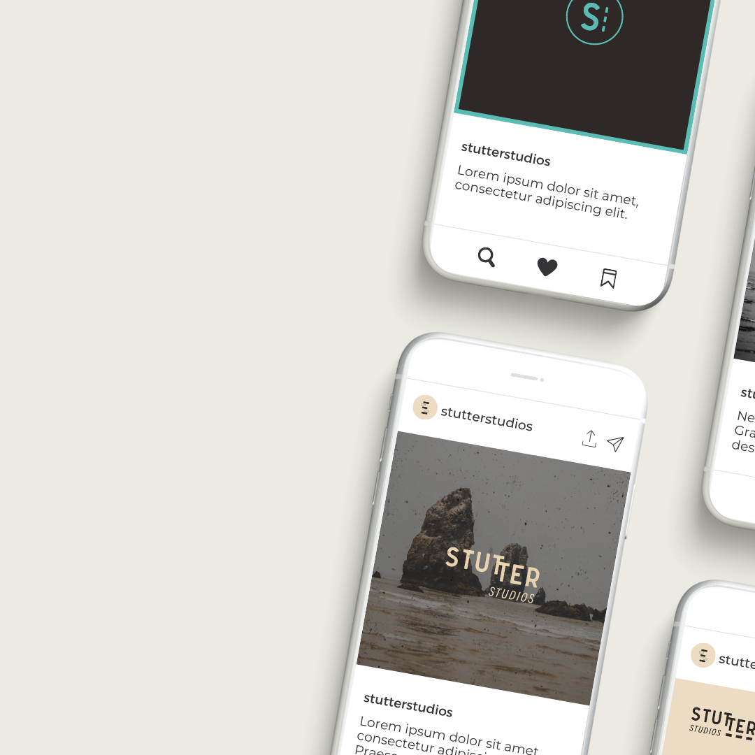

Social media content representing how the branding can be used as a cohesive unit.
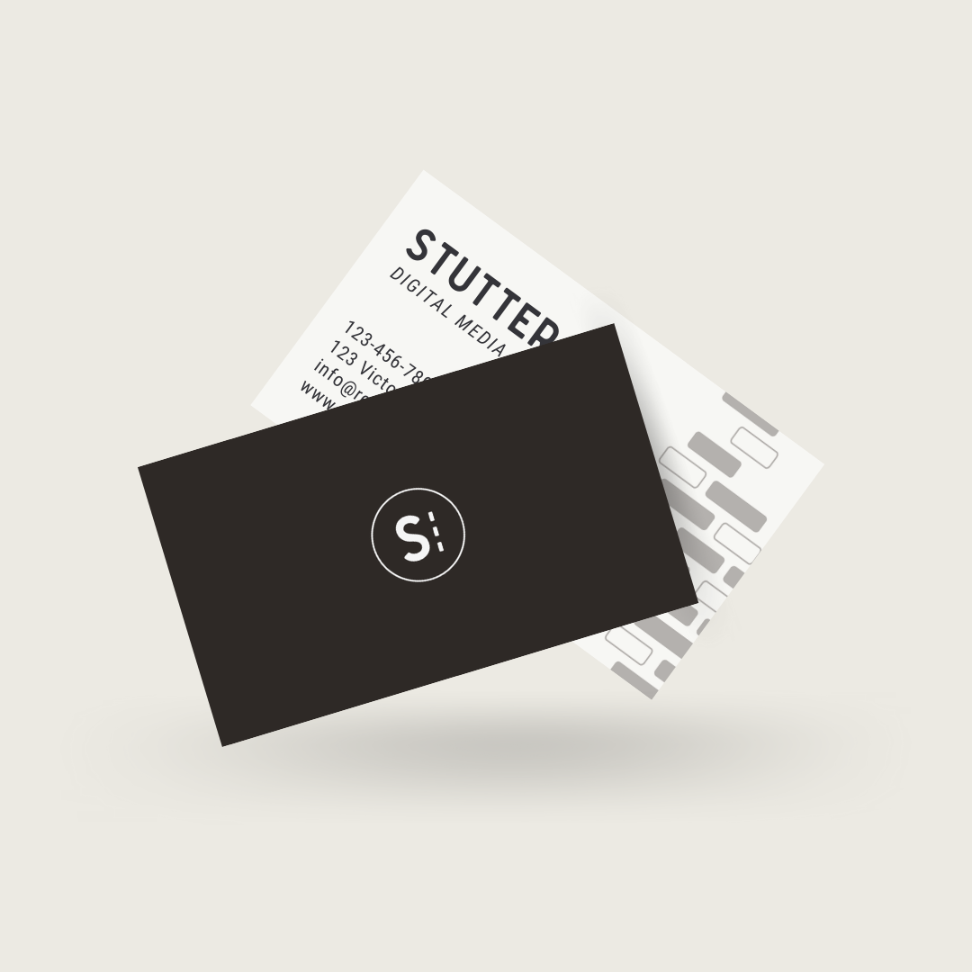
Business card designs

BUILDGREEN
Sustainable Building Products
- complete rebrand, created a visual identity, typographic system, colour palette and custom pattern -
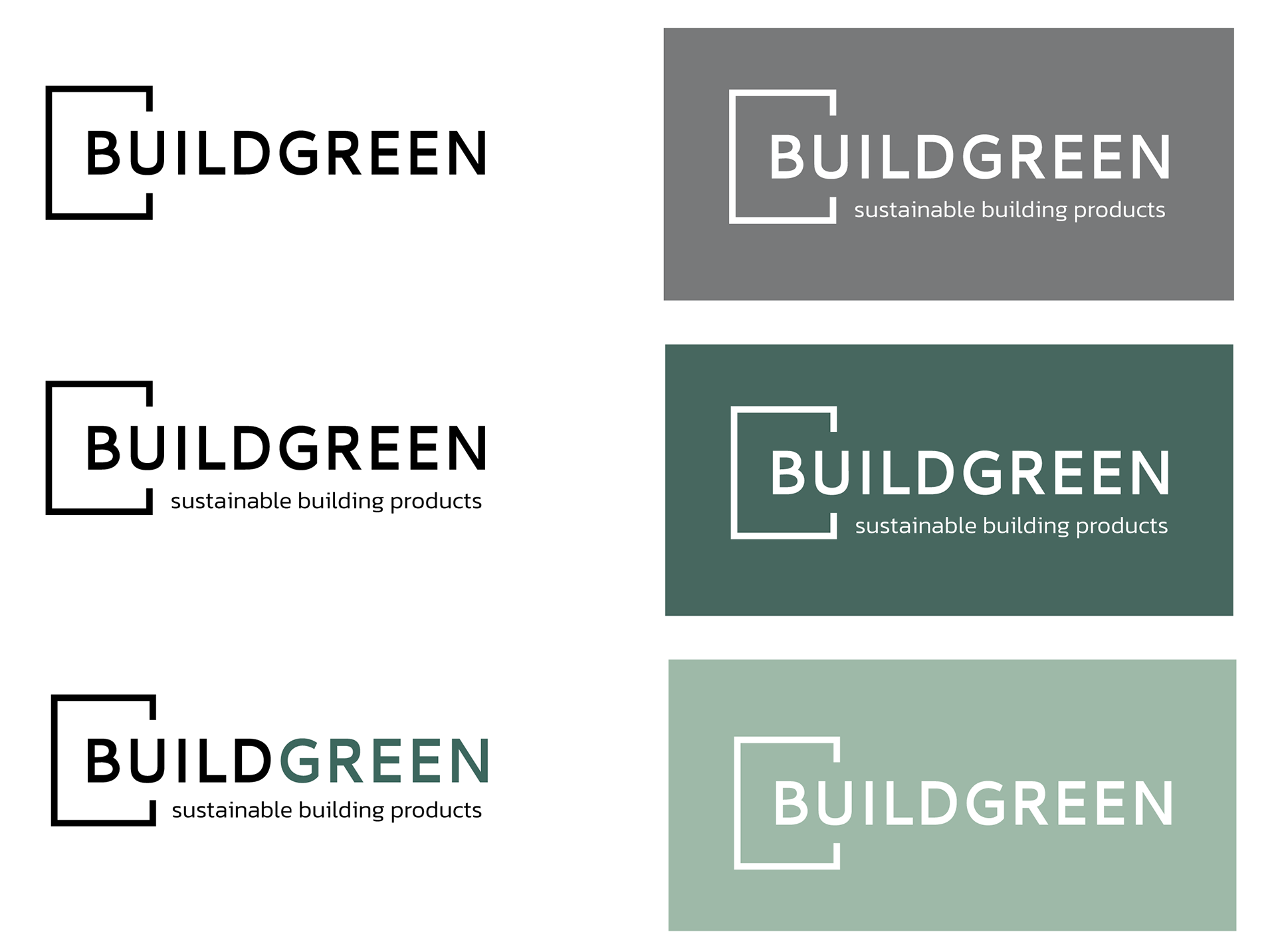
Primary logo applications and colour versions

secondary logo application

icon
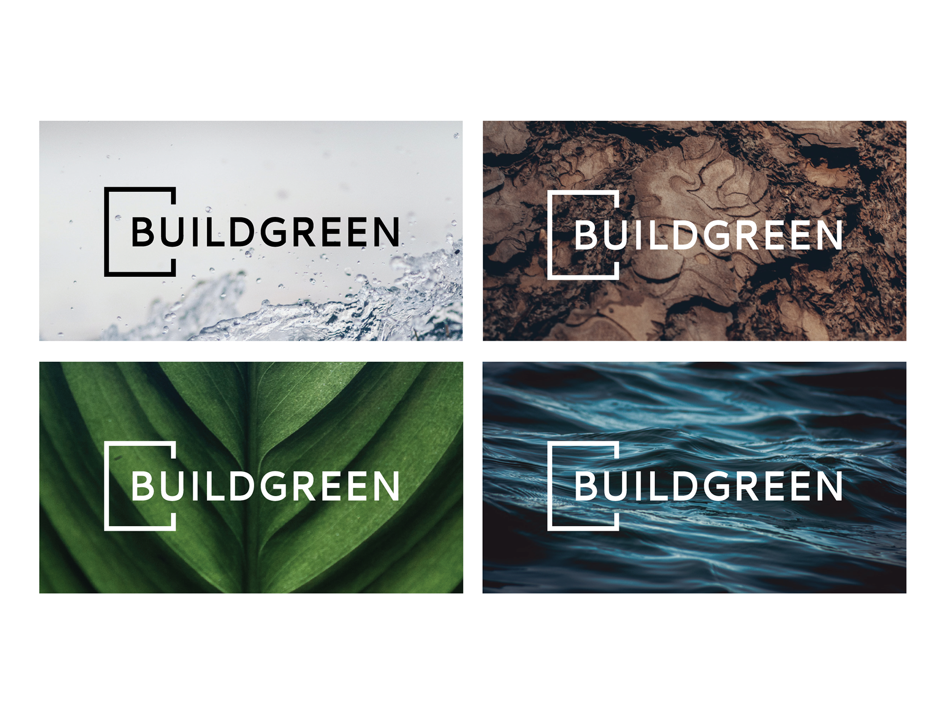
Logo application
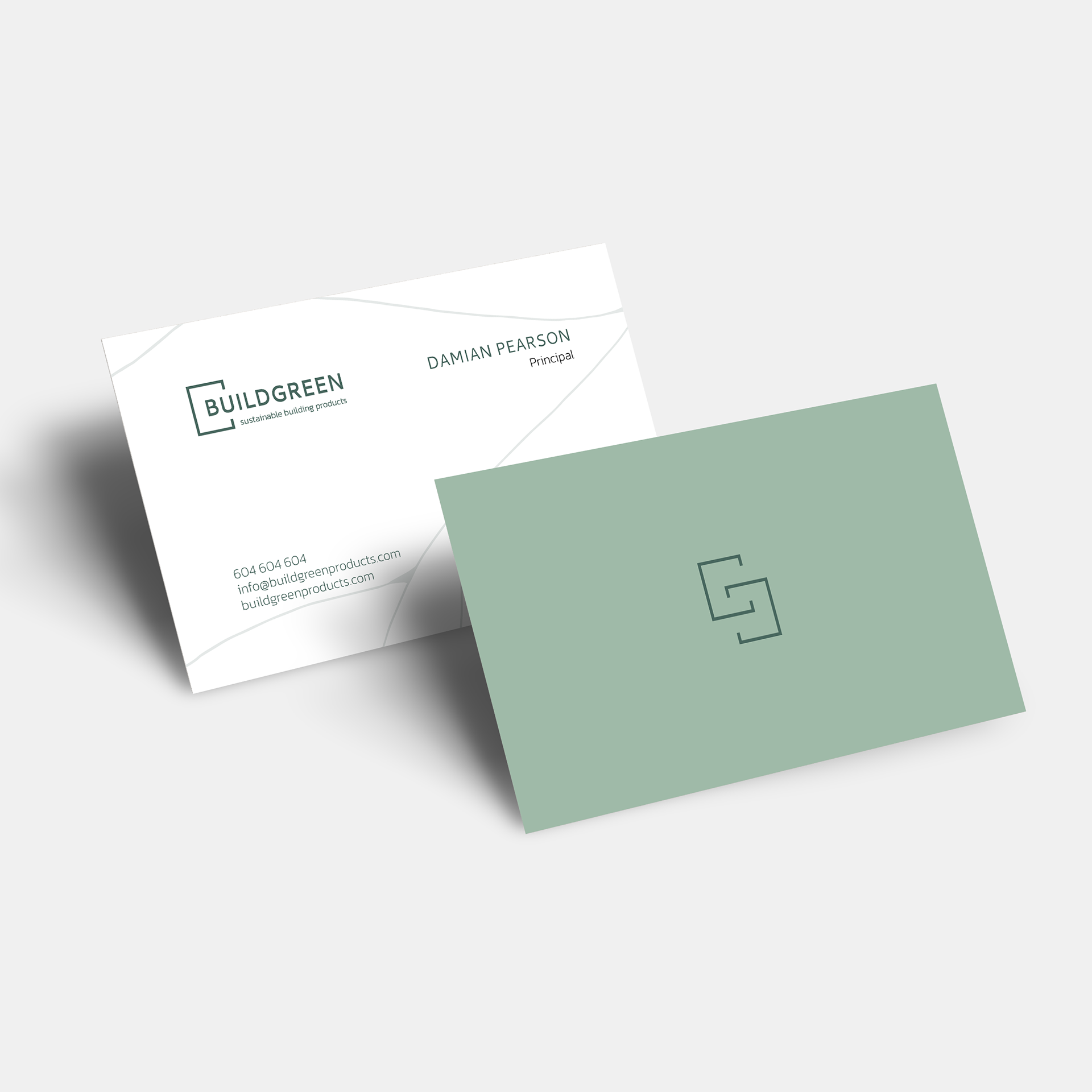
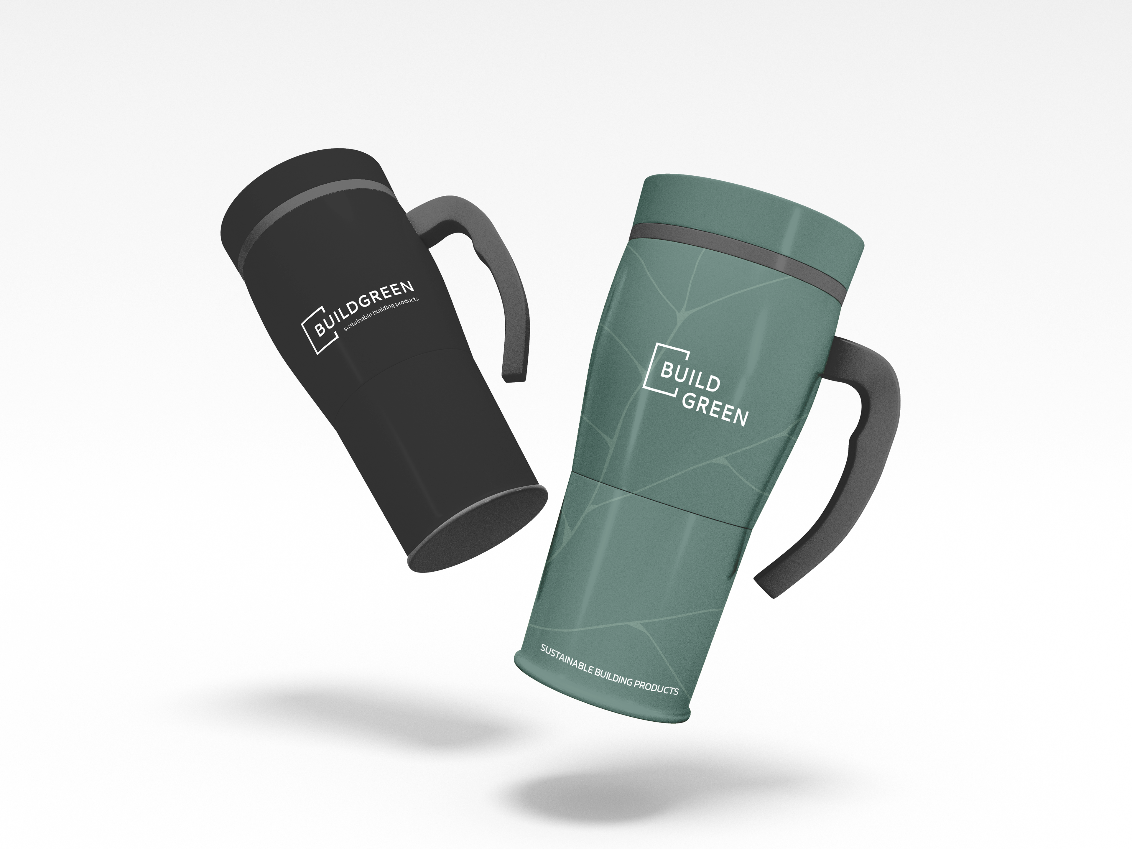
Business card designs
Collateral
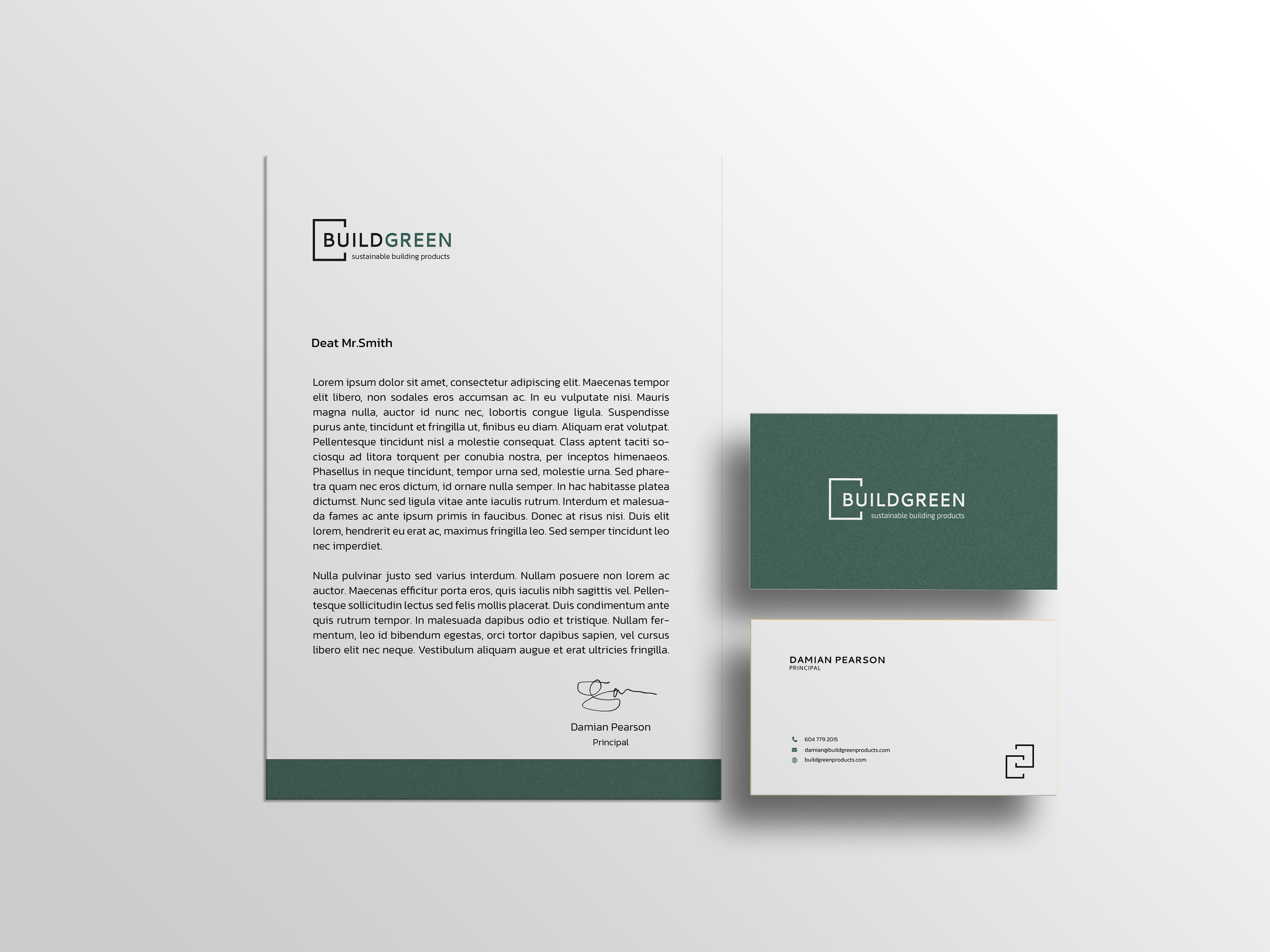
Print collateral

custom texture: leaf veins

colour palette
In contrast with the sharp, clean lines of the Buildgreen logo are the custom textures: leaf veins. With expertise and professionalism comes the movement and fluidity of growth; both in the literal sense of preserving the planet and the metaphorical sense of a shift in mindset and attitude.
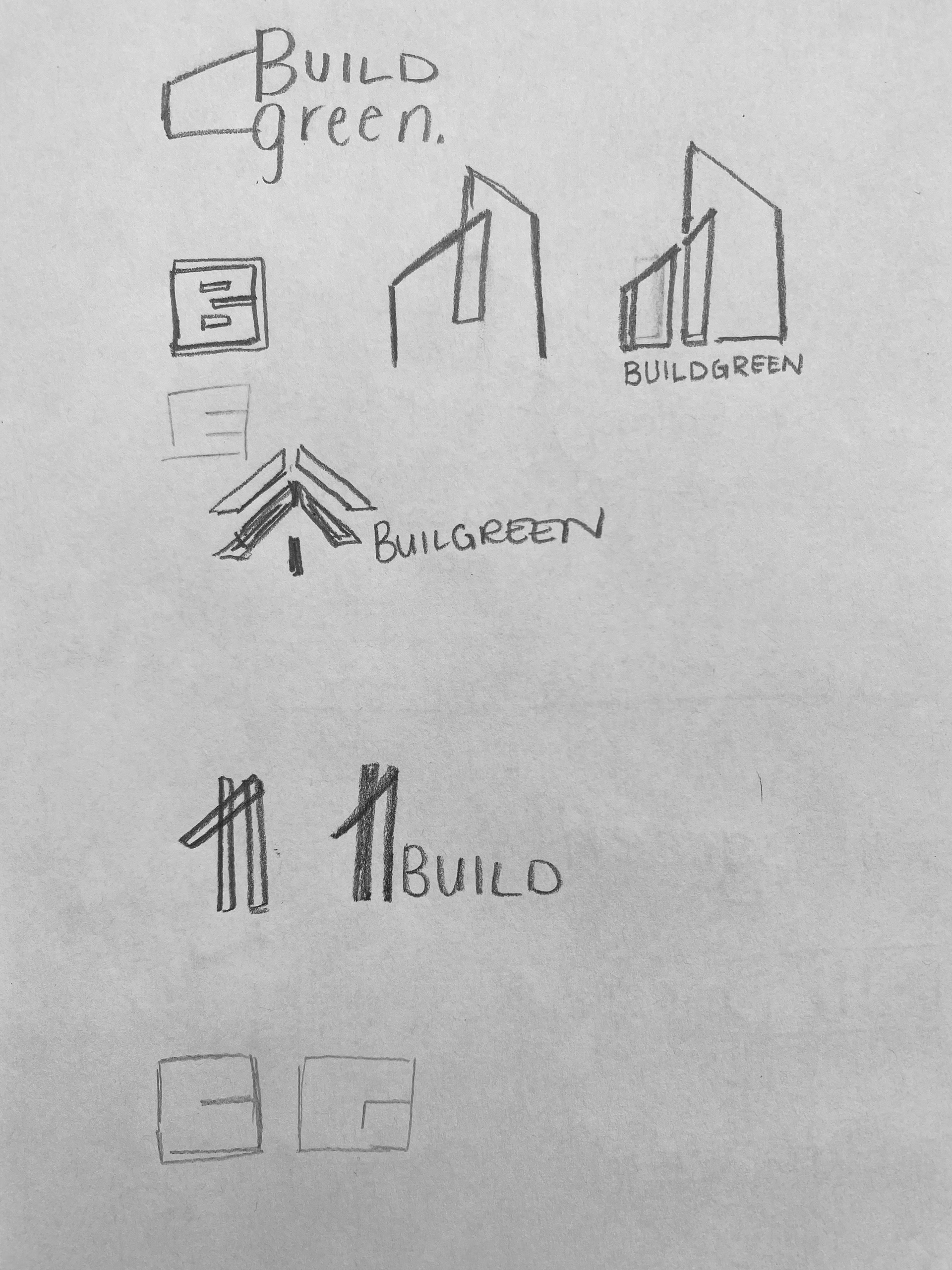
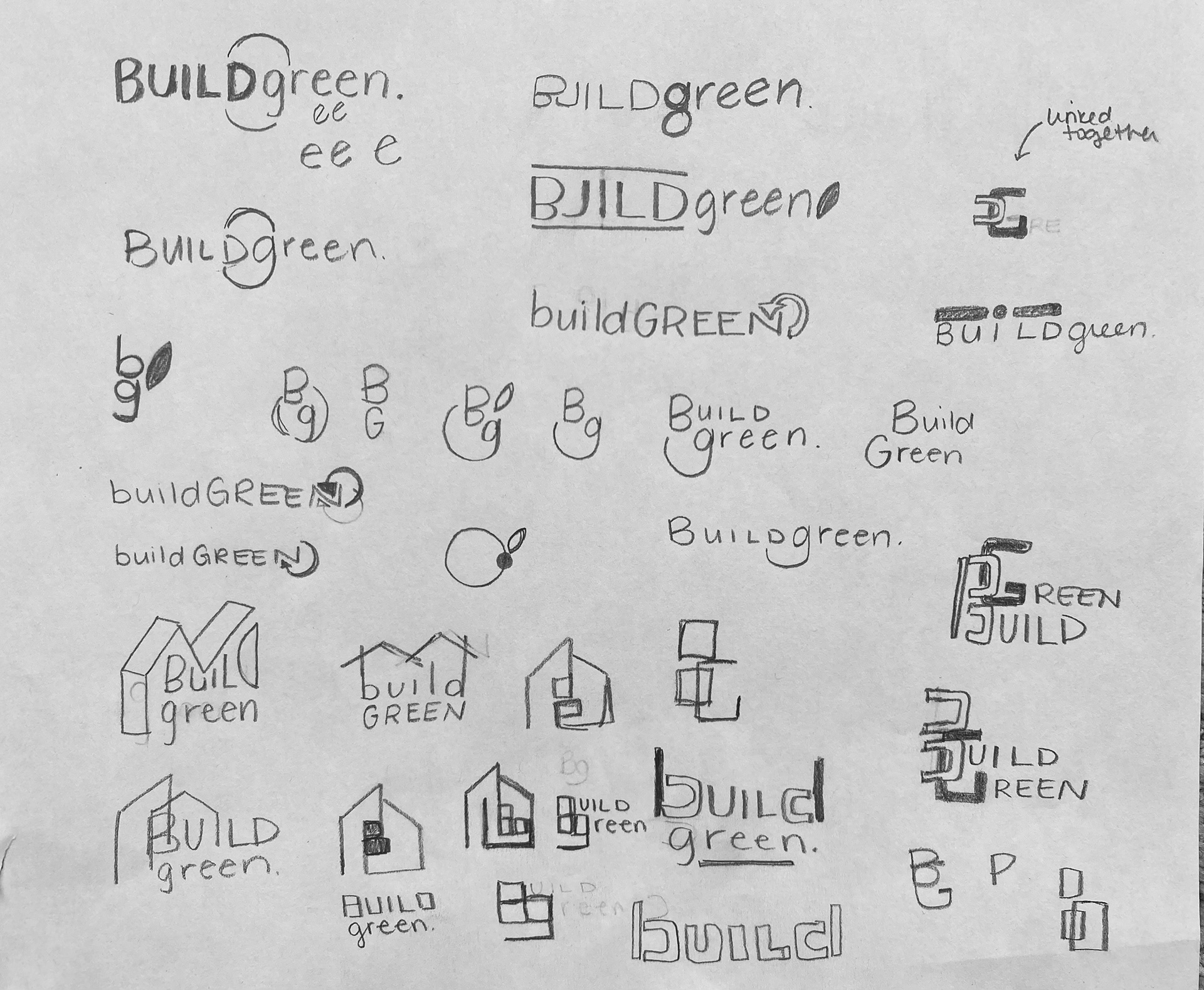

thumbnail sketches
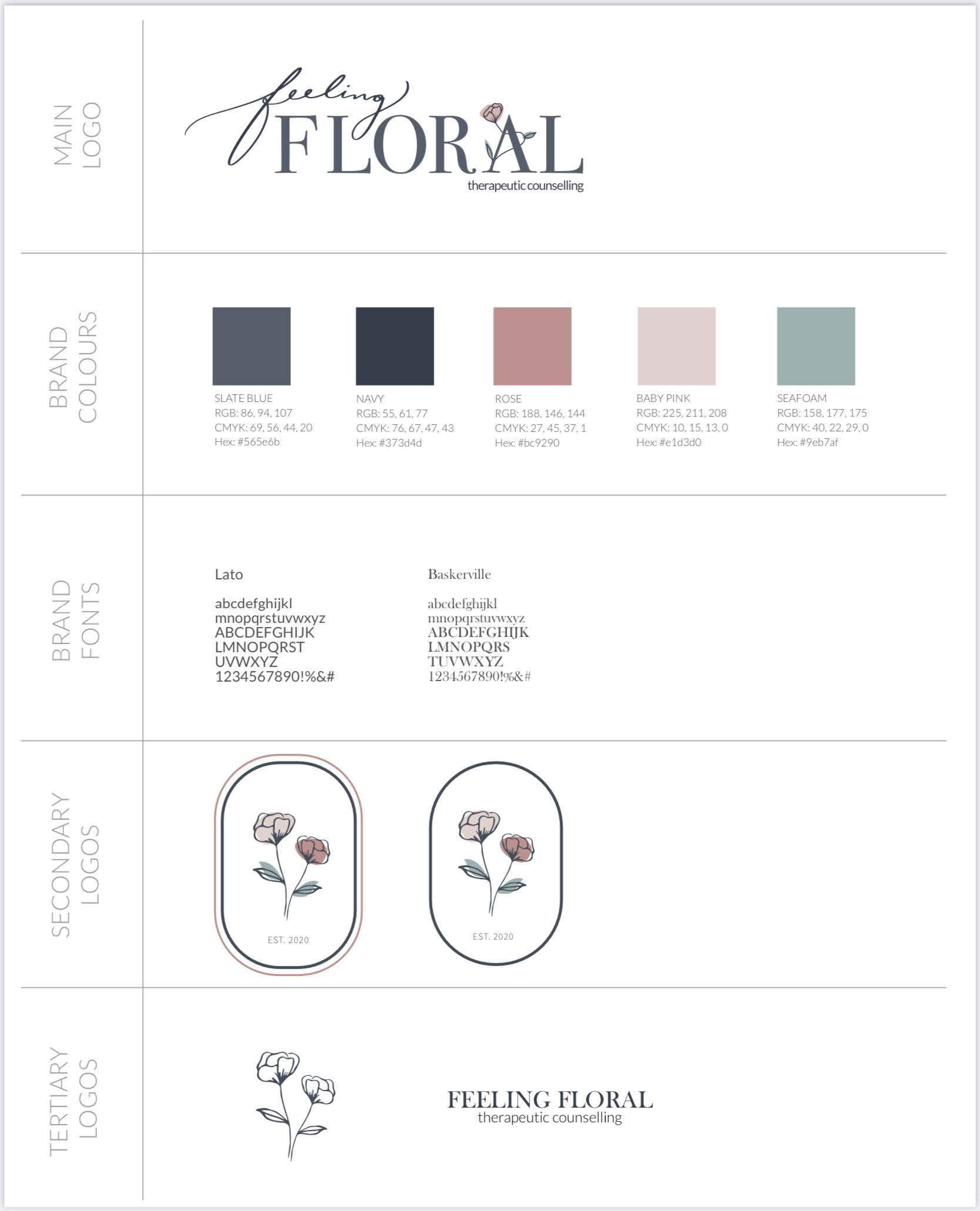
FEELING FLORAL
Therapeutic Counselling Practice
- created a visual and brand identity, typographic system, colour palette and website design -

Primary logo design and variations

Secondary logo design
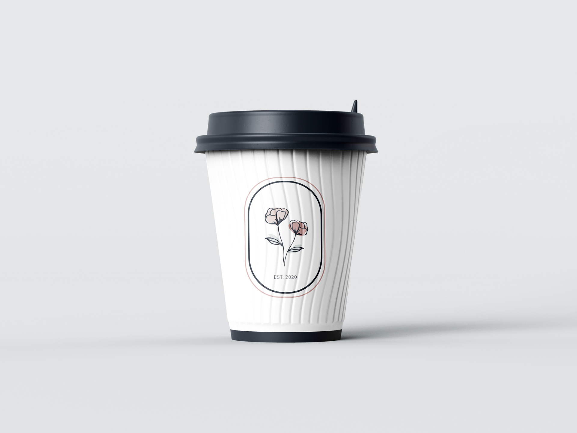
Collateral design
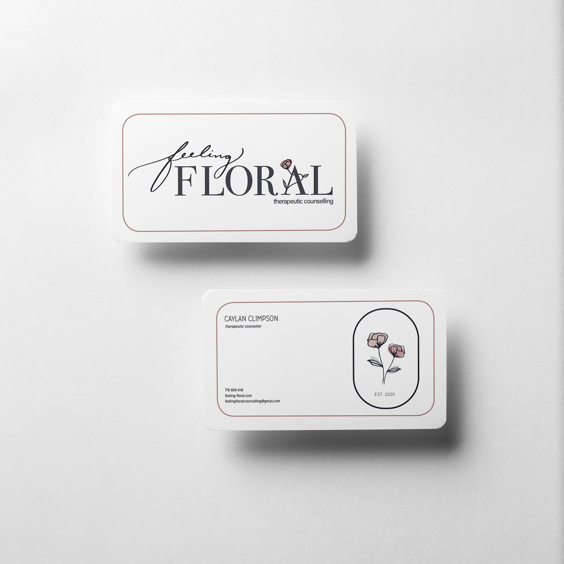
Business card design

Print collateral

Website landing page design
Style tile
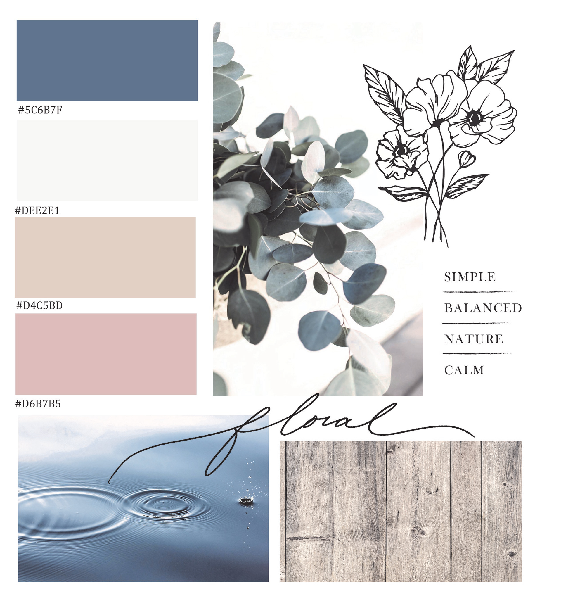
Mood board and colour palette
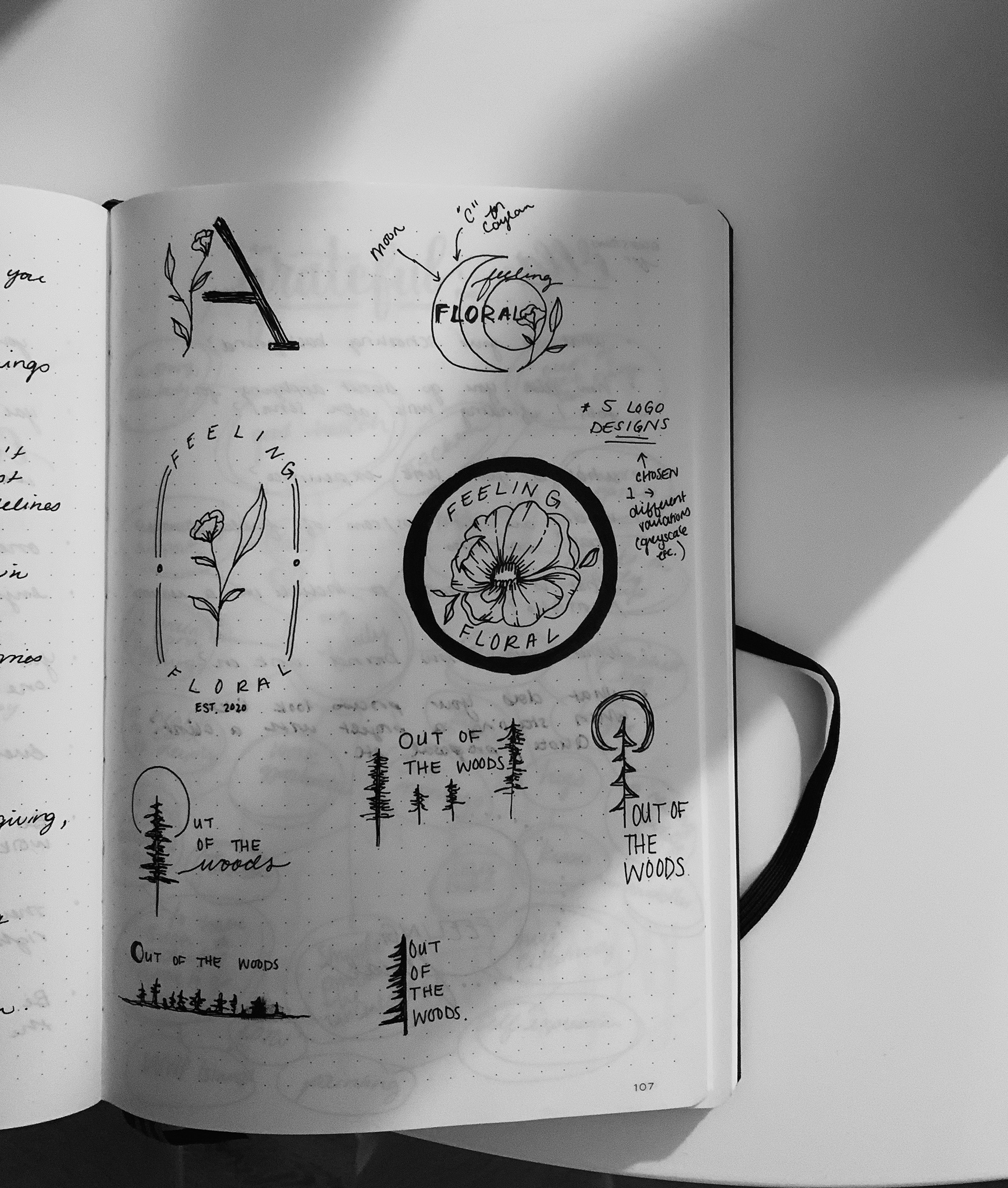

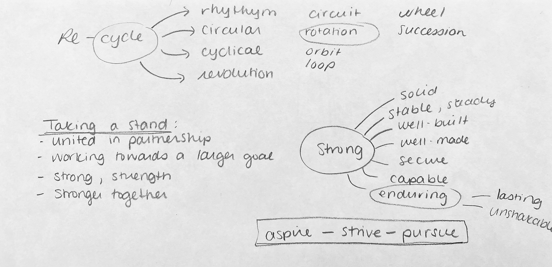
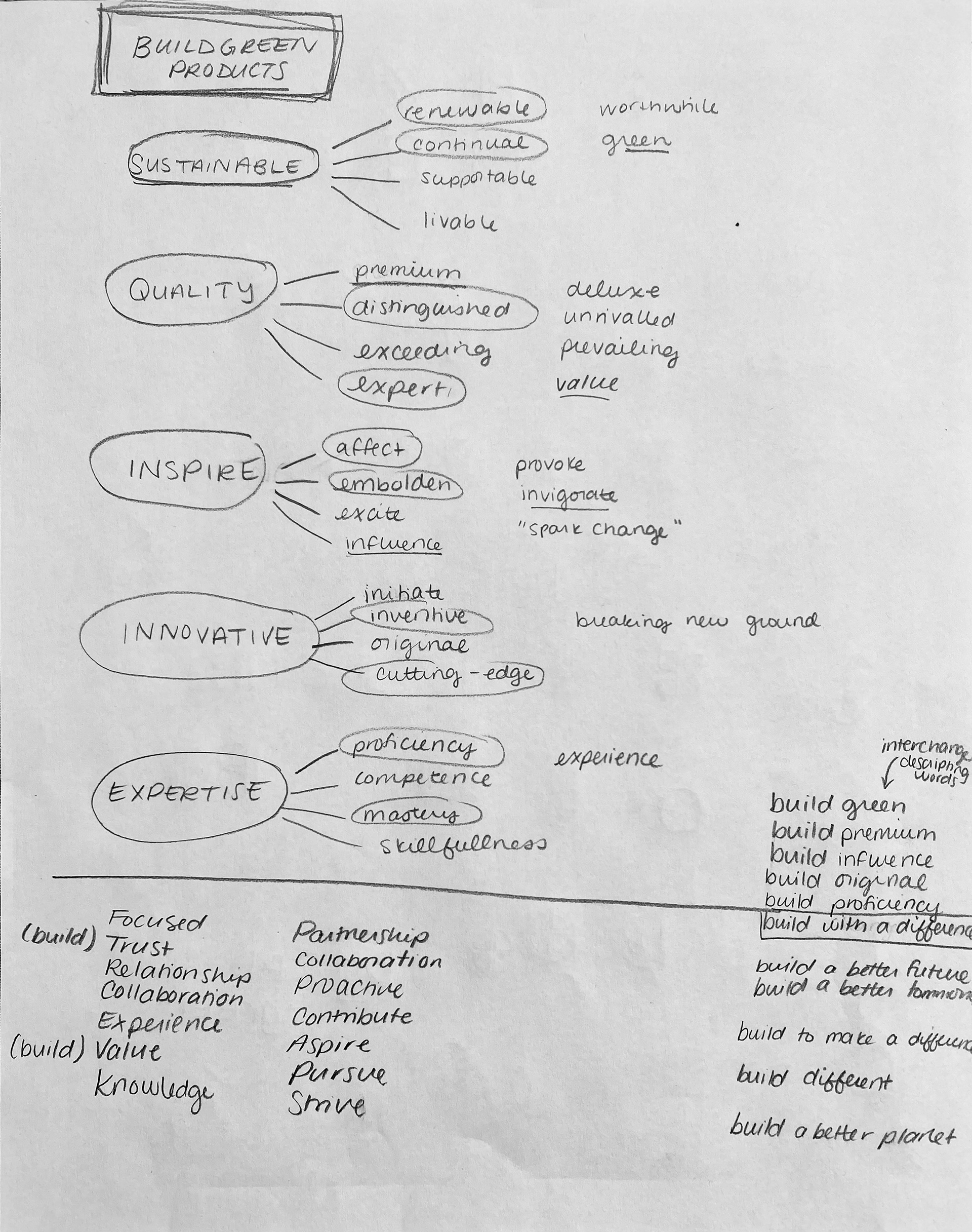
thumbnail sketches

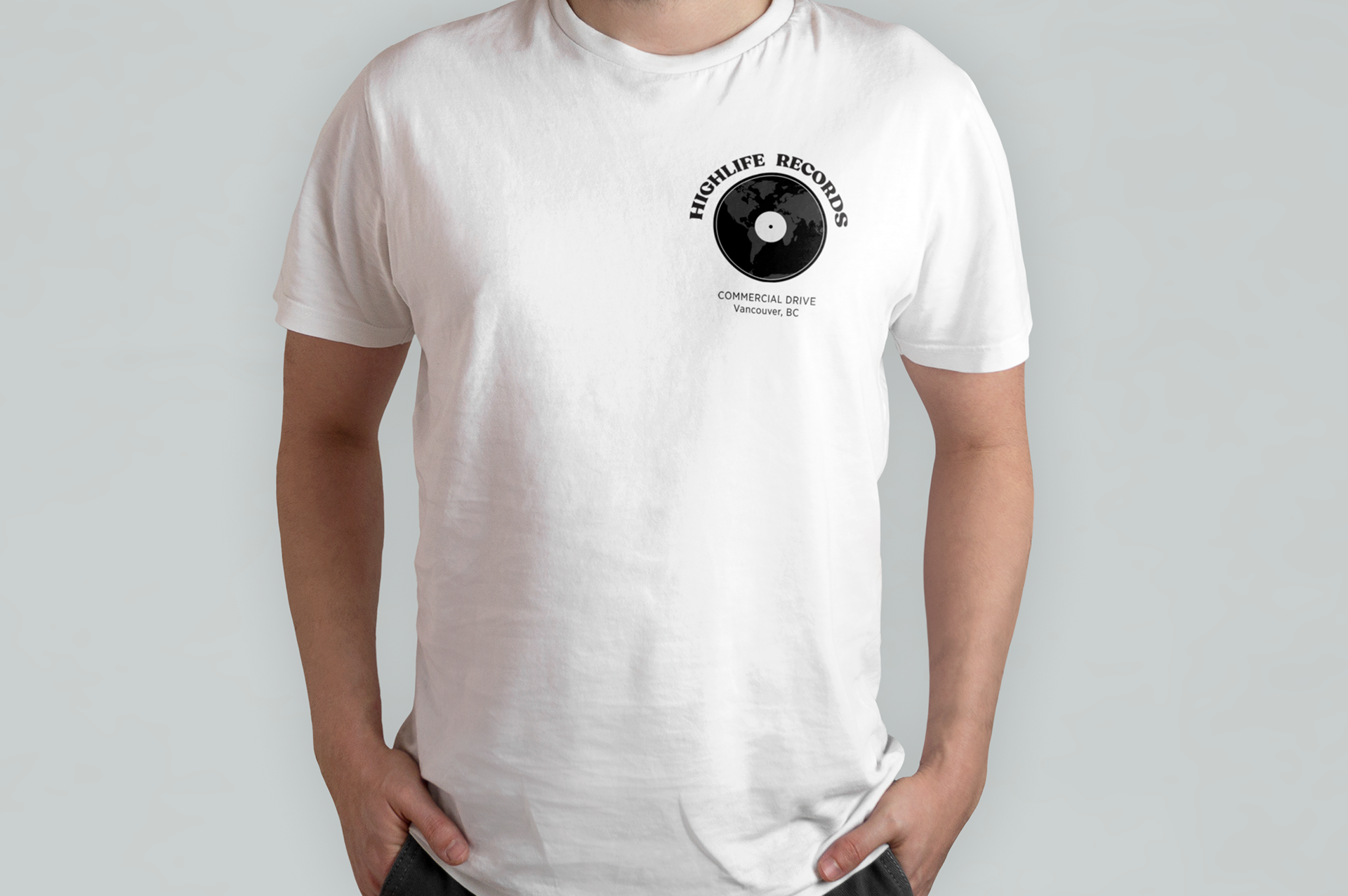
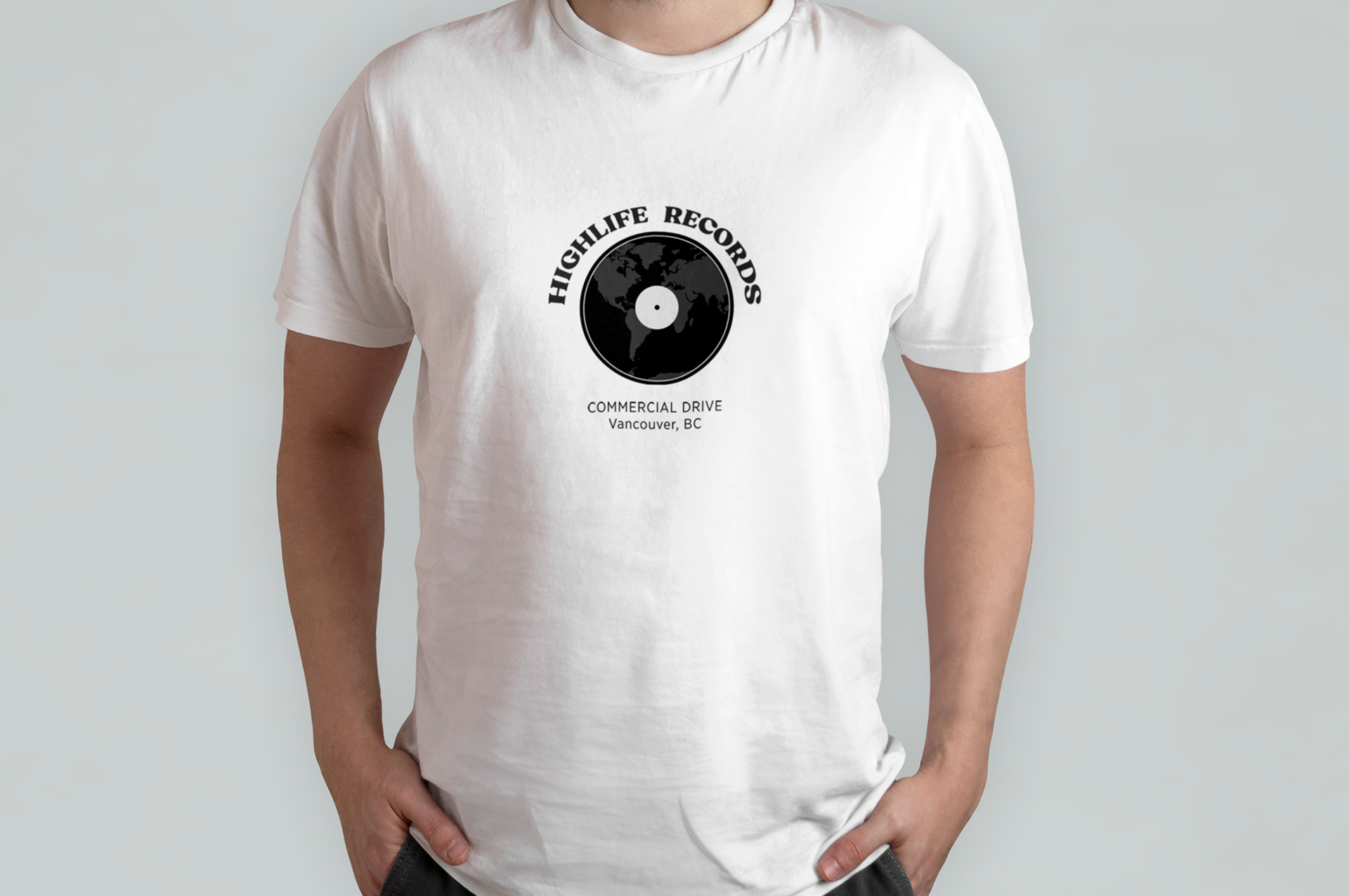
HIGHLIFE RECORDS & MUSIC
Record Store
- logo refresh and collateral design -
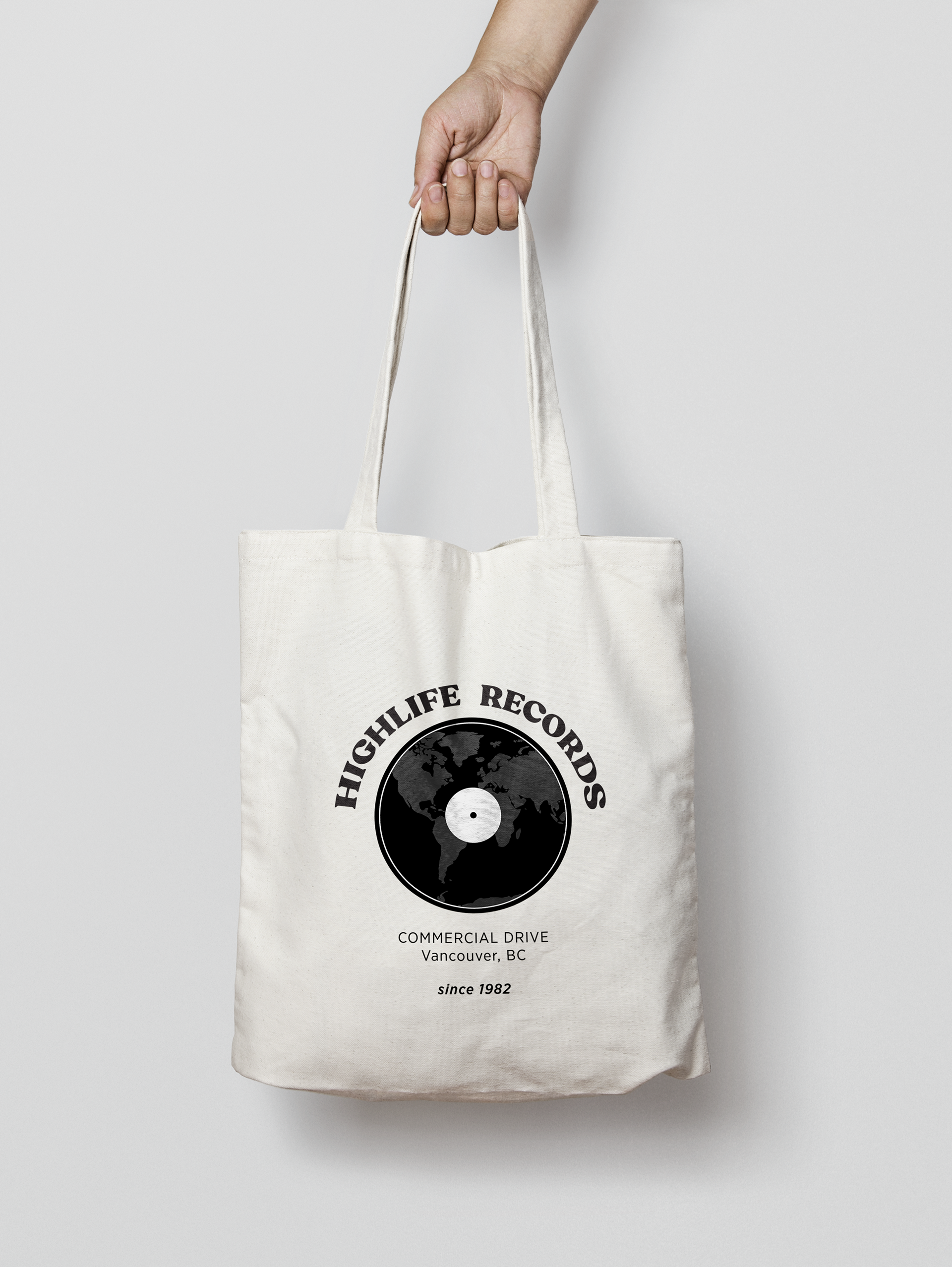
Tote bag and t-shirt collateral design
Current logo
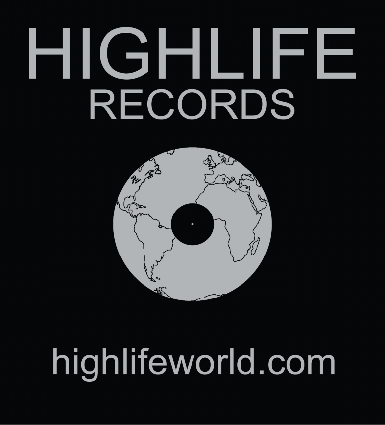
Refreshed Logo
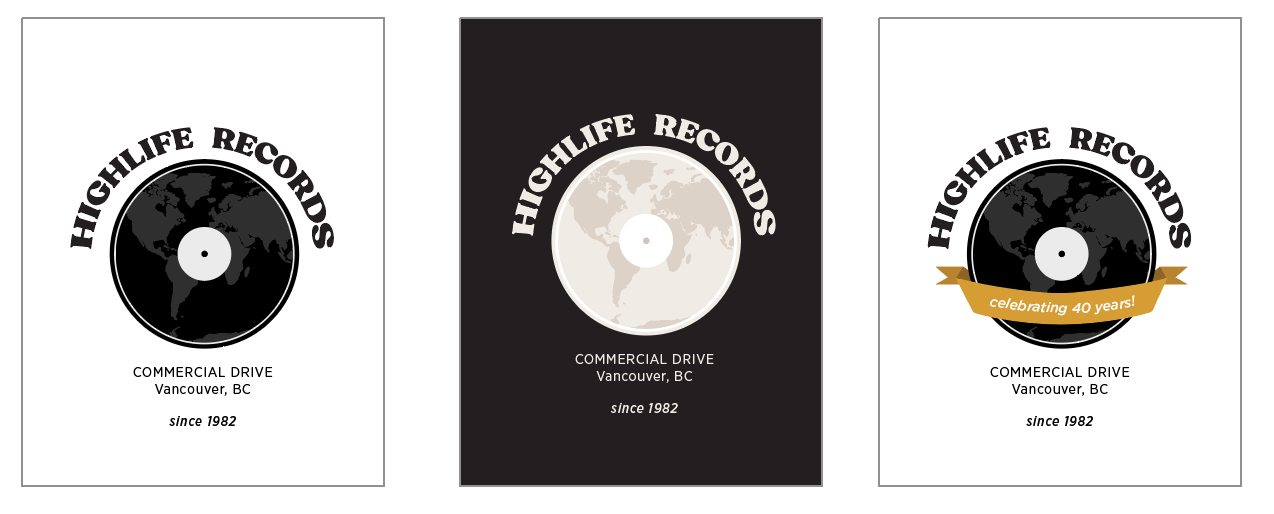
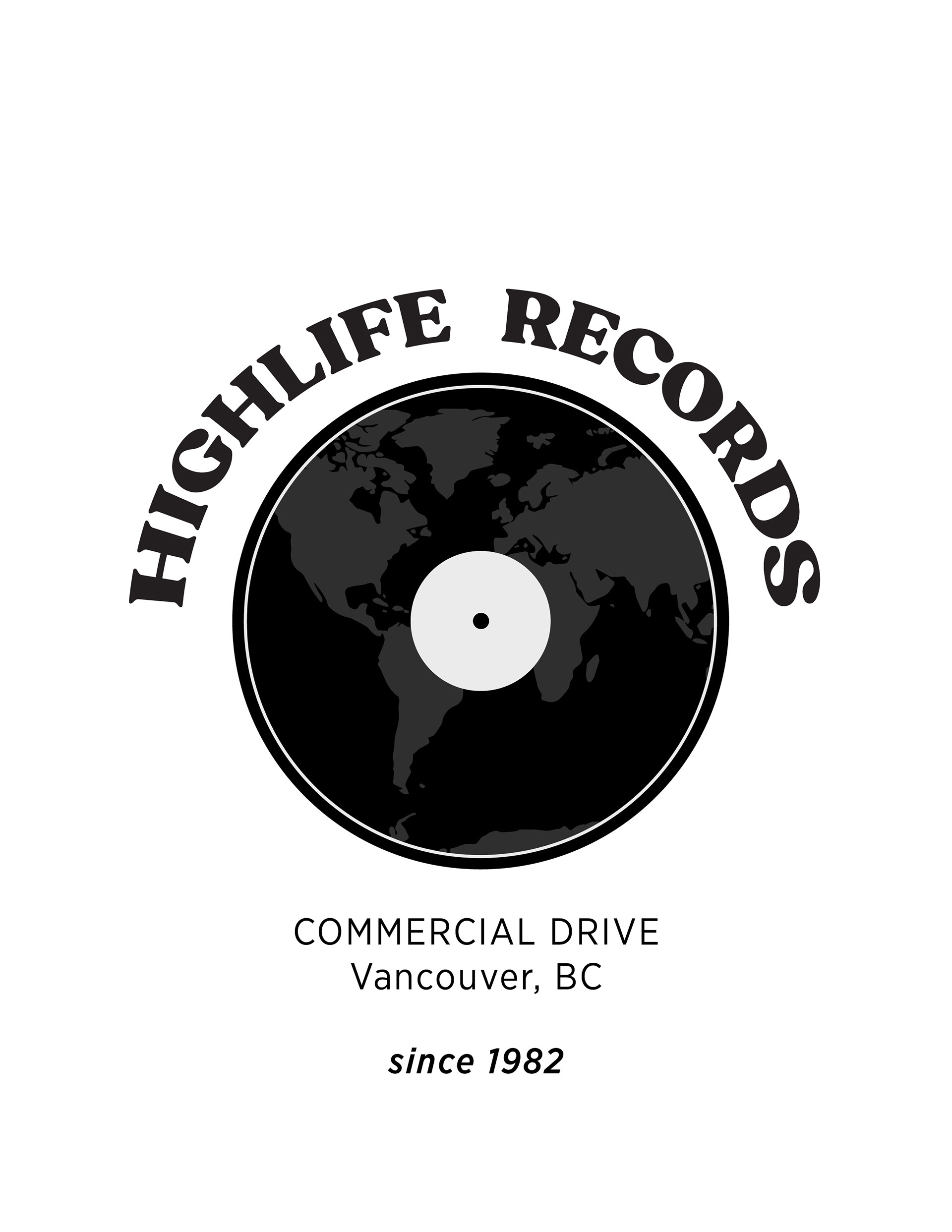
Greyscale, Light and 40th year anniversary logo variations
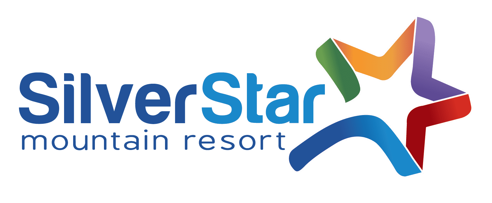
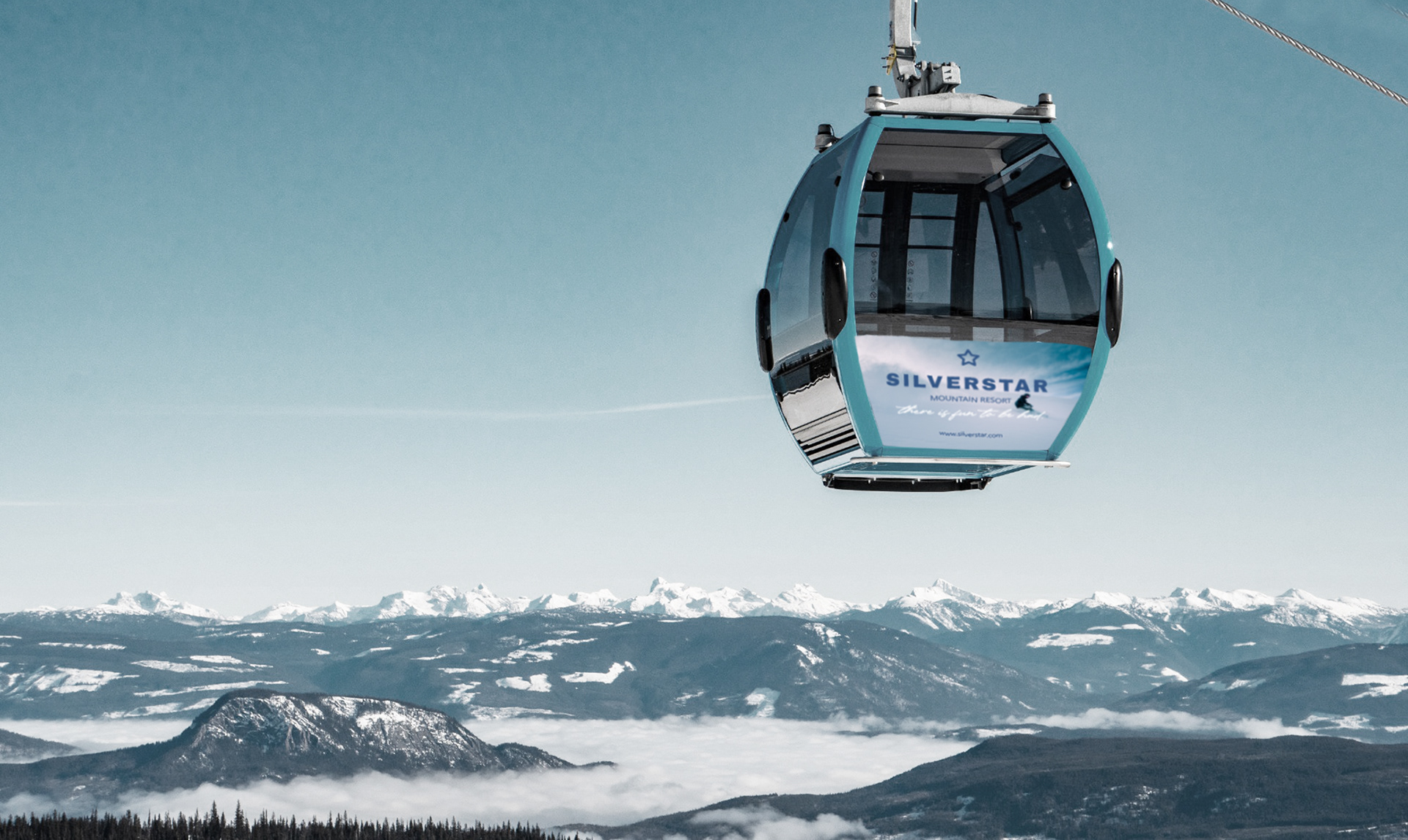
SILVERSTAR MOUNTAIN RESORT
Ski Resort
- complete rebrand, editorial and collateral design -
CURRENT

REBRAND
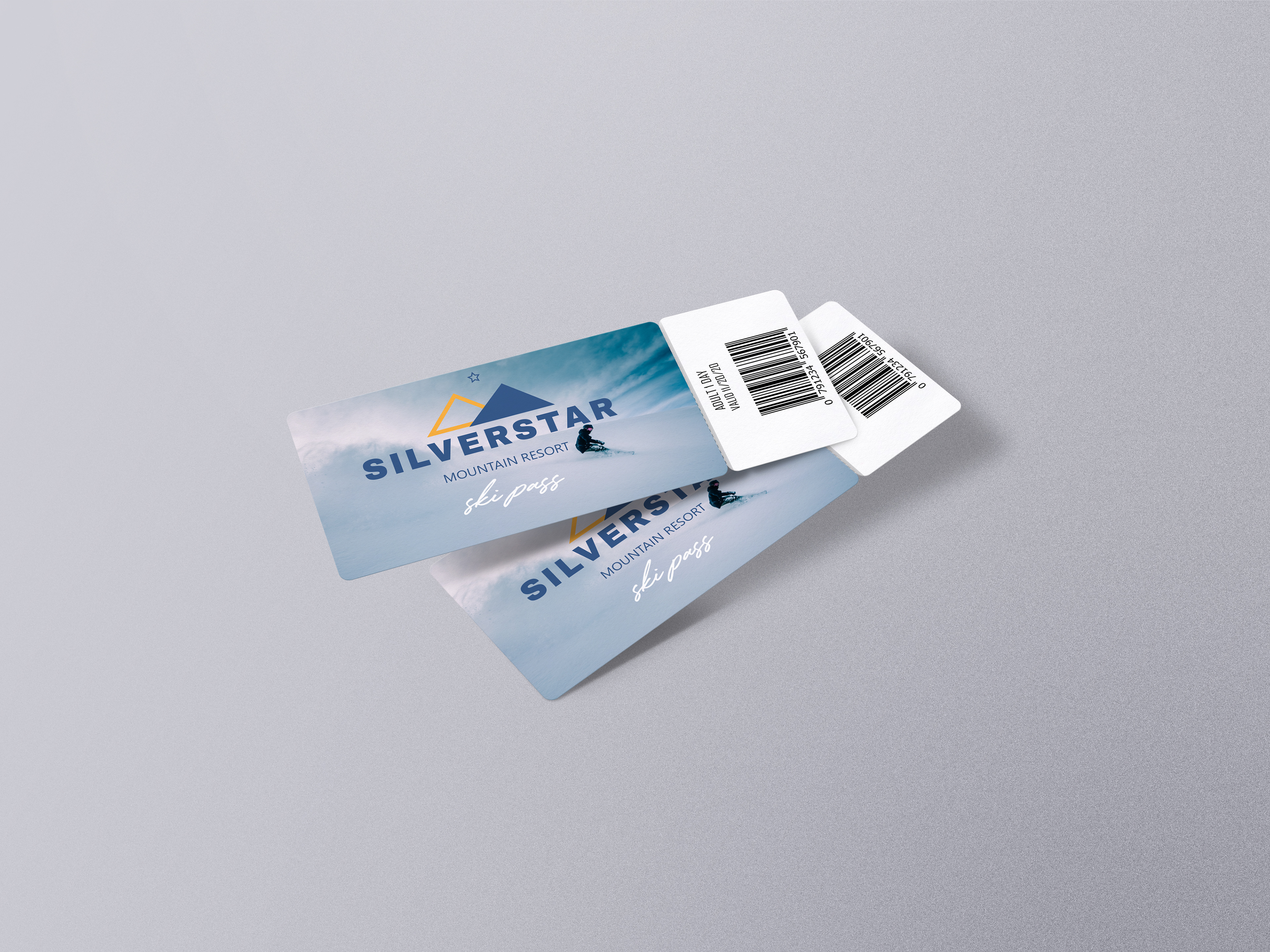
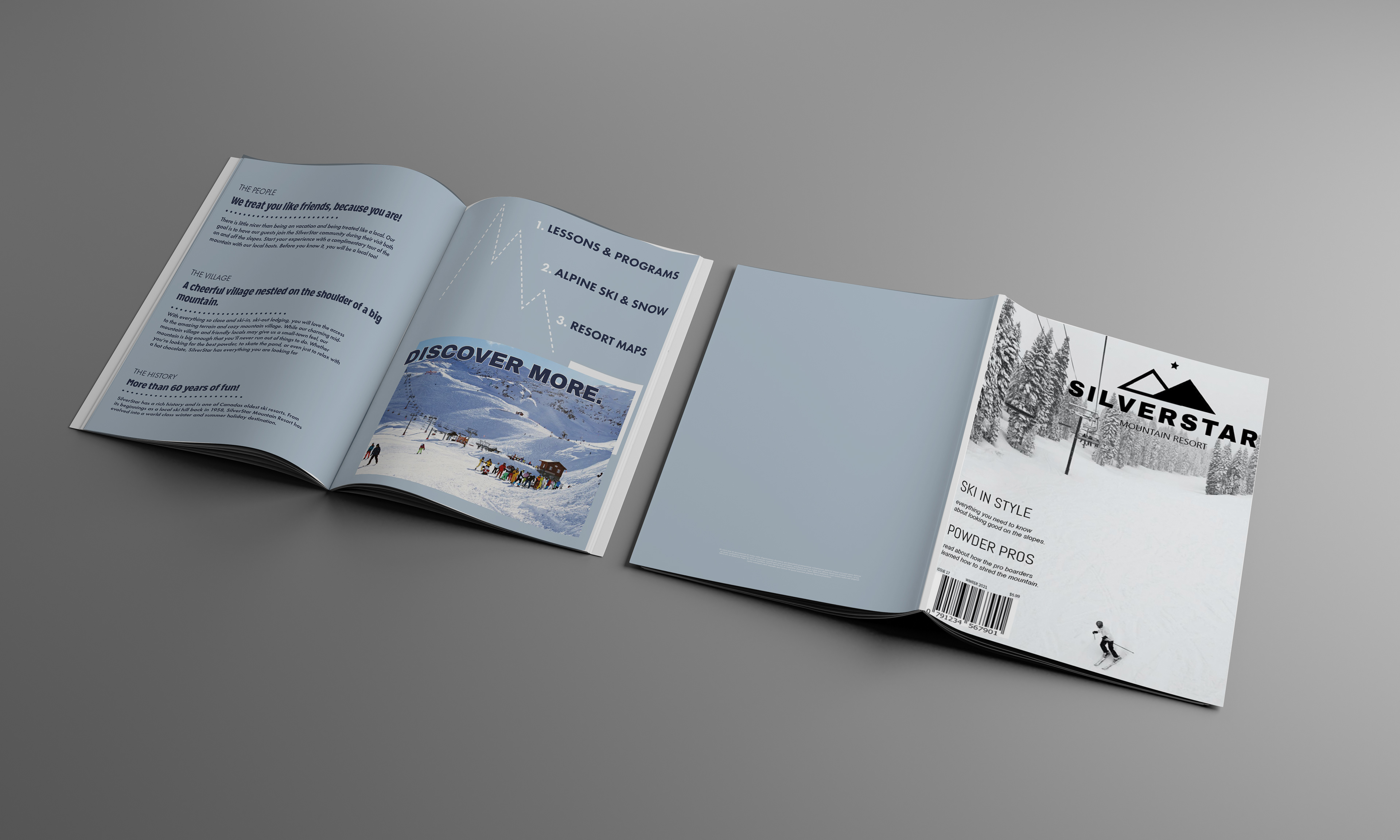


Collateral design: ski pass lift tickets, publication and variety of advertisements
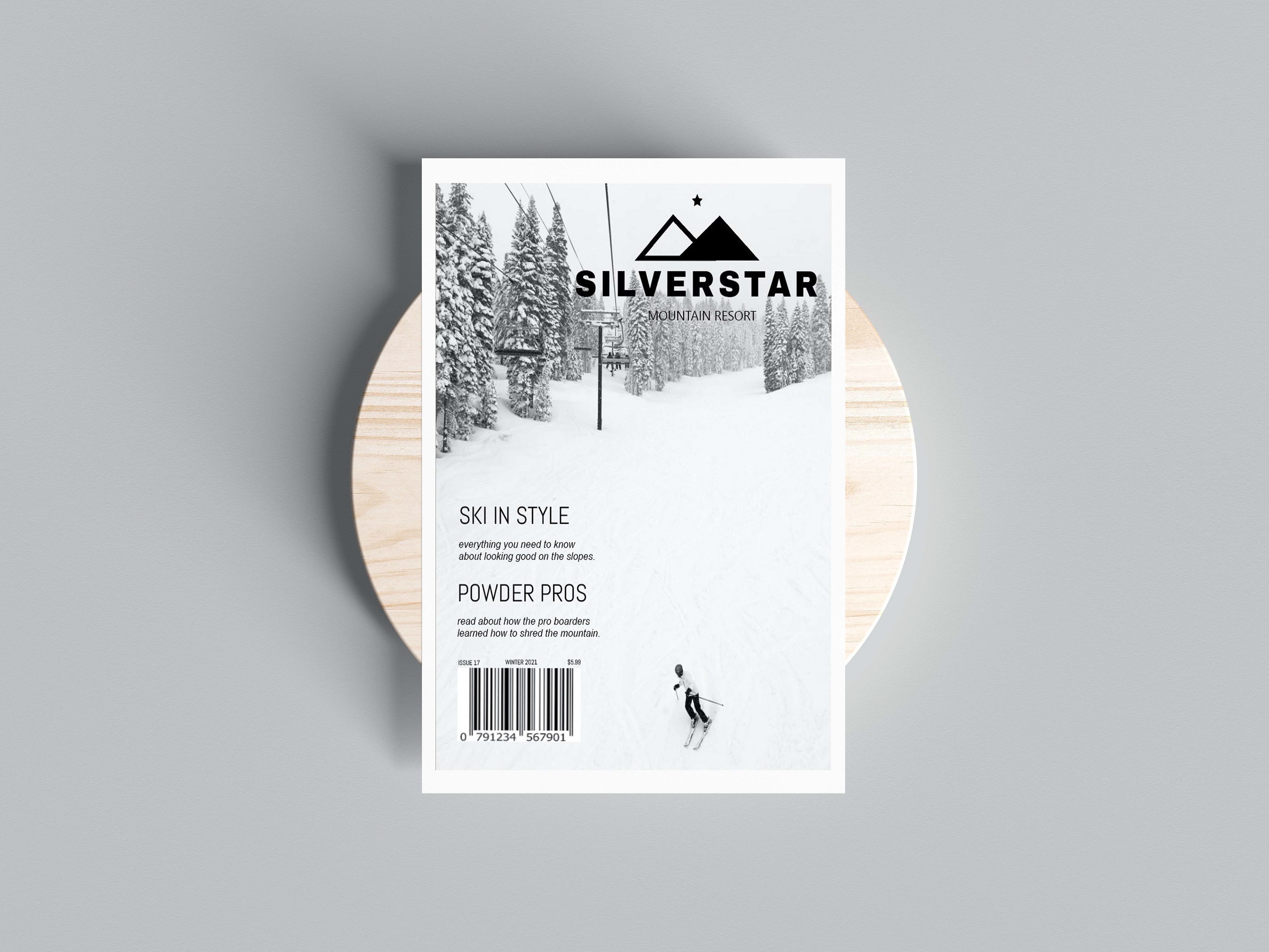
Silver Star Mountain local publication - editorial design.

Logo variations, colour palette and typography selections.